
A CTA, or a call-to-action, is any little chunk of text that encourages users to act. Basically, it is a button and a bit more info around it that is aimed at taking a person further through a sales funnel. CTAs appear on the main and product pages of online stores, on any website, and landing. Likewise, you can’t imagine a newsletter or a pop-up screen without a CTA.
Being created and located artfully, calls-to-action favorably affect your website’s conversions. Therefore, marketers pay so much attention to every tiny aspect regarding these buttons.
The message is crucial because it should convince people to press the button and add to a cart, subscribe, or download. The look of a CTA button is not less critical since it must be visible to a visitor. Finally, the placement and quantity of CTAs largely influence their efficiency.
This article will consider five CTA examples by renowned online retailers and reveal what makes them actionable.
1. Visible to the Maximum: Stradivarius
The ultimate goal of an online shop is to make people purchase. Everything is subordinated to this idea, and one of the core points here is working on a CTA button design. Take a look at how Stradivarius handled this task.
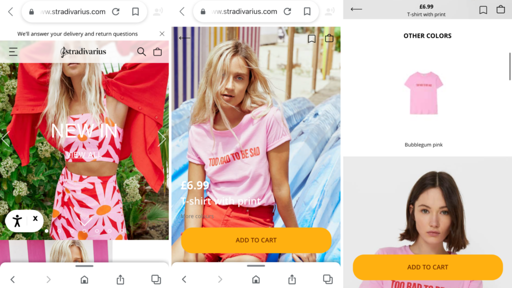
Screenshots taken on the official Stradivarius website
There are at least three tricks worth borrowing:
- The first is the flamboyant orange color of the “Add to Cart” button.
- The second is its breadth: the button takes up the entire screen width, which is handy when using the mobile version.
- The third is that the button is pinned to the bottom of the screen. So, when you scroll the product page down, the CTA remains in sight.
However, a couple of problems hinder you from enjoying shopping in this online shop. The performance of the website, as well as its usability, leave much to be desired. We’d recommend rebuilding mobile-unfriendly stores as progressive web apps using, for instance, Magento PWA Studio.
*2. Creative: Kendra Scott
As we’ve mentioned above, there are various types of CTAs that you can apply to improve sales. Or, for example, urge prospects to sign up and reduce costs of customer acquisition.
An American online jewelry store Kendra Scott goes even further and combines two aims at once in their CTA.
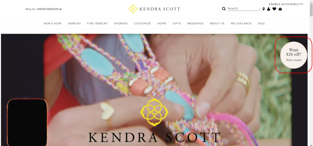
Screenshot taken on the official Kendra Scott website
In the screenshot above is a button that offers you to invite someone else in exchange for a $20 discount. As you’ve tapped, you’re suggested to subscribe to the newsletter or/and mention three more mails of your friends in order to get the price-off. Again, this CTA travels with you across all pages, always within the screen’s visible part.
3. Underlining a Benefit: Batsheva
Almost all online stores greet newcomers with pop-ups asking for a subscription. But people tend to promptly close such messages unless they’ve offered something appealing in return.
This can be an instant discount for the first order, the promise to inform about secret sales or the membership in the loyalty program for rewards. In practice, most companies opt for the first variant.
Take a look at the screenshot from Batsheva, a New York-based clothing brand. All the content inside the pop-up should be considered as a part of a call-to-action. Here is one of the most succinct, effective, and yet non-standard CTA examples we’ve seen in online retail. It highlights the advantage of signing up (“get 20% off of your first order”), and the button attracts with its unusual and catchy wording: “I’m in”.
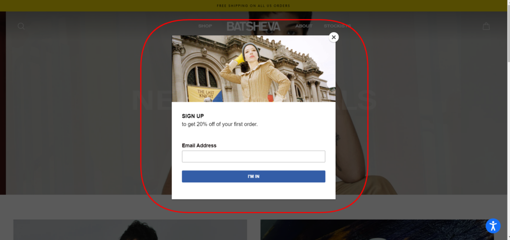
Screenshot taken on the official Batsheva website
4. Personalized: Lush
The move towards deeper personalization in digital marketing, sales, and customer service is unstoppable. Brands track your search history on their sites, analyze purchases, wish lists, and abandoned carts to explore your preferences. Then, they send you personified emails based on these findings to cater to your taste.
But, let’s go back a bit. Personalization starts from simply changing the tone of voice to a less formal and personal appeal.
Look at the screenshot below from the newsletter send-out by Lush. The “you” expressions, together with the overall mood of the letter, make the company itself closer to the audience. The “Get yours” title on the button instead of something customary like “Shop now” or “Learn more” upholds the whole concept of the email.
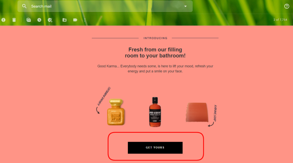
Screenshot taken from the newsletter from Lush official website
5. Several CTAs on the Page: Cariuma
To cause an action, eCommerce websites have to invent and check the whole strategy of the CTA’s usage (by the way, A/B testing is your biggest helper on this way).
The location and quantity of CTAs play a huge role in the success of your online shop. The aim is to place calls to action in the most convenient way for customers.
In the screenshot below is one product page in the online shop of a Brazilian shoe brand Cariuma. When you press the big “Add to cart” button, you instantly see the checkout pop-up window. You can close it and continue to explore the product. But the title on the main button will alter to “Checkout” to remind you about the next step.
If you don’t perform the desired action, the “Forget something?” pop-up appears on the right. It invites you to view the cart. This approach allows keeping CTAs noticeable for users.
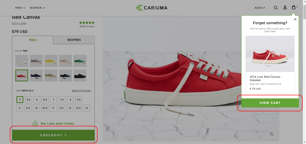
Screenshot taken on the official Cariuma website
Wrapping Up
As you see, there are plenty of methods to improve calls-to-action on your eCommerce website. The major takeaways can be the following. Firstly, revise the location of all your CTAs. Then, draw attention to their appearance: size, shape, and font. After that, think over the concise and attractive wording. Make use of A/B testing tools to find out what works better exactly for your clients.
About the Author:

Kate Parish is the Chief Marketing Officer at Onilab with over 8 years of experience in Digital Marketing in the sphere of eCommerce web development. Kate always aspires to broaden her competency in line with cutting-edge global trends. Her primary areas of professional interest include SEO, branding, PPC, SMM, Magento PWA development, and online retail in general.
Guest Post Service By www.guestarticlehouse.com